plot(mtcars$disp, mtcars$mpg, xlim = c(100, 200))   # DROPS points outside the range
ggplot(mtcars, aes(disp, mpg)) + geom_point() +
coord_cartesian(xlim = c(100, 200)) # zooms, keeps every pointAppendix A — Base R ↔︎ ggplot2: A Rosetta Stone
A.1 Introduction
Appendix A is a lookup table, not a chapter. You do not read it; you keep it open next to whichever system you are working in and use it to move a plot across.
Every row maps one base R construct to its nearest ggplot2 equivalent, and the last column is the part that matters: when to stop translating and switch.
Two things this appendix is not. It is not a ggplot2 tutorial — there are better ones, and the ggplot2 documentation is excellent. And it is not an argument for either system. Chapter 1 made that argument; this is the translation layer.
This book does not use ggplot2. No example here is evaluated, and no figure on this page requires it. The ggplot2 side appears as code you can read and run yourself, but the book is built without the dependency and stays that way. Only the base R column is rendered.
A.2 The one-sentence version
ggplot2 is a declarative system: you describe what the data means and let the package decide how to draw it. Base graphics is a direct system: you issue drawing commands and the marks appear.
Everything below is a consequence of that difference. Declarative systems infer grouping, transform scales and build facets for you. Direct systems do none of it until you write it.
A.3 Marks and coordinates
The most-used arguments translate almost one to one, because they describe marks rather than structure.
| Base R | ggplot2 | When to switch |
|---|---|---|
pch = 19 |
shape = 19 |
Never. Same idea. |
cex = 1.4 |
size = 3 |
Never — but note size is not a linear multiple of cex; it is in millimetres, so you must retune. |
col = 'red' |
colour = 'red' |
Never. |
bg = 'yellow' |
fill = 'yellow' |
Never. bg only applies to shapes 21–25, which are already filled. |
lwd = 2 |
linewidth = 1 |
Never — same non-linearity as cex. |
lty = 2 |
linetype = 'dashed' |
Never, though ggplot2 also accepts the numeric codes. |
type = 'p' |
geom_point() |
Switch when you start mapping a variable to mark properties. |
type = 'l' |
geom_line() |
Never. |
type = 'b', 'o' |
geom_line() + geom_point() |
Never — two layers, which is the ggplot2 idiom. |
type = 'h' |
geom_histogram() |
Switch. ggplot2 bins separately from the plot. |
type = 'n' |
ggplot() + a layer only |
Never, but type = 'n' is how you set up axes for manual layering. |
plot(x, y) |
ggplot(df, aes(x, y)) + geom_point() |
Switch as soon as the plot has a third variable. |
points(x, y) |
+ geom_point(data = ...) |
Stay in base for overlays onto an existing plot. |
lines(x, y) |
+ geom_line(data = ...) |
Stay in base for overlays. |
text(x, y, labels) |
geom_text(aes(label = ...)) |
Switch when labels are data-driven rather than hand-placed. |
mtext(s, side) |
labs(title=, caption=) |
Never for titles; side has no ggplot2 equivalent. |
title(main, sub) |
labs(title, subtitle) |
Never. |
abline(a, b) |
geom_abline(intercept=, slope=) |
Never. |
segments(), arrows() |
geom_segment(), geom_arrow() |
Never. geom_segment is the easy one to miss. |
polygon() |
geom_polygon() |
Never. |
A.3.1 The scale trap
cex = 2 is not size = 2. cex is a multiplier on the device’s default text size; ggplot2’s size is an absolute diameter in millimetres. If you carry a plot across and change nothing else, the marks will be the wrong size, and the usual response — nudging the number until it looks right — makes the code meaningless to the next reader.
A.4 Titles, labels and ranges
| Base R | ggplot2 | When to switch |
|---|---|---|
main = 'x' |
labs(title = 'x') |
Never. |
sub = 'x' |
labs(subtitle = 'x') |
Never. |
xlab, ylab |
labs(x = , y = ) |
Never. |
xlim, ylim |
coord_cartesian(xlim=, ylim=) |
Always. See below. |
log = 'x' |
scale_x_log10() |
Switch. plot(log = '') rescales in place with no warning; scale_* transforms the data and labels the axis for you. |
asp = 1 |
coord_fixed() |
Never. |
A.4.1 xlim is not coord_cartesian(xlim =)
This is the single most damaging translation error, so it is worth being precise.
The base version removes observations outside the limits before drawing. The ggplot2 version zooms and keeps them, ready to be revealed if the limits move. The base idiom is faster and the ggplot2 one is almost always what you meant. If you are unsure which you have, count your points either way.
A.5 Grouping and the language difference
Base graphics has no concept of a grouping variable. You make groups by subsetting and looping. ggplot2 has one, and it is the reason people switch.
| Base R | ggplot2 | When to switch |
|---|---|---|
col = as.numeric(factor(g)) |
aes(colour = g) |
Switch. ggplot2 recycles a palette; base gives you 1..k integers that look like nonsense colours. |
pch = as.numeric(factor(g)) |
aes(shape = g) |
Switch. |
legend('topright', legend, pch, col) |
automatic, via mapped aesthetics | Switch. This is the big one — base legends are written by hand. |
text(..., labels = g) on points |
geom_text(aes(label = g)) |
Stay in base for a handful of direct labels. |
for (g in g) { plot(d[g,]); } |
facet_wrap(~ g) |
Switch once there are more than about three panels. |
par(mfrow = c(2, 2)) + plot() |
facet_wrap(~ g, nrow = 2) |
Switch, but see the caveat below. |
layout(matrix(...)) |
facet_grid() / patchwork |
Switch. Ragged panels are the one thing base layout() does that ggplot2 does not do well without a second package. |
Colour is where the difference bites hardest, and it is worth showing what the base version actually costs:
# The base R idiom. Correct, and nobody writes it twice.
g <- factor(mtcars$cyl)
# as.numeric(g) gives the factor CODES 1..k, not the labels. Hand them to
# palette() to get colours, because R will happily accept the raw integers
# and draw palette entries 1, 2, 3 as if you had meant them.
cols <- palette()[as.numeric(g)]

plot(mtcars$disp, mtcars$mpg, col = cols, pch = 19,
     xlab = 'Displacement', ylab = 'Miles per gallon')
legend('topright', legend = levels(g), pch = 19,
       col = palette()[1:3], bty = 'n')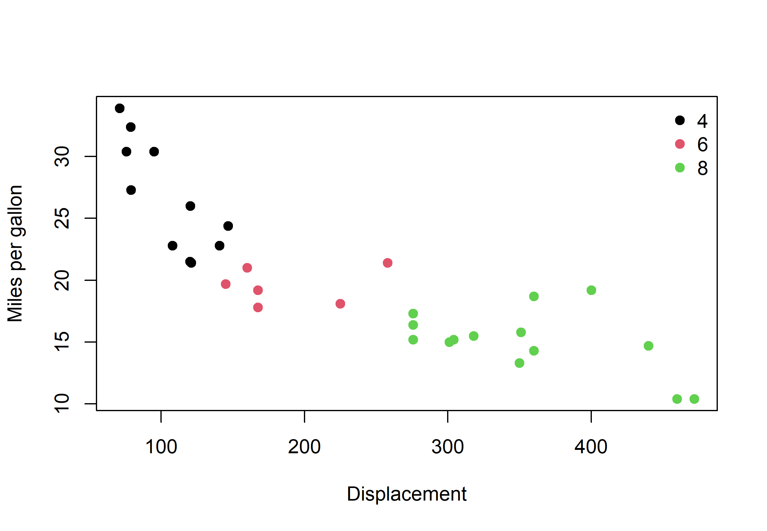
Three things had to happen by hand that ggplot2 would have done for you: recycle a palette across the groups, label the groups from the factor levels, and build a legend whose colours match the plot. Worse, the code above is one careless edit away from silently wrong — change as.numeric(g) to as.numeric(levels(g)) and the legend no longer matches the points, with no warning from R.
The same plot in ggplot2 is one aes(colour = cyl) mapping and a free legend, but it needs ggplot2. That trade is Chapter 1’s argument in miniature.
A.6 High-level functions
These are the ones that do the most work per line in base R, and most have no ggplot2 counterpart because ggplot2 builds them from layers.
| Base R | ggplot2 | When to switch |
|---|---|---|
barplot(table(g)) |
geom_bar() on counts |
Stay in base for a quick categorical count — table() is one call. |
barplot(h, beside = TRUE) |
geom_bar(position = 'dodge') |
Never. |
barplot(m, beside = FALSE) |
geom_bar(position = 'stack') |
Never. |
barplot(..., horiz = TRUE) |
coord_flip() |
Never. |
boxplot(y ~ g) |
geom_boxplot(aes(x = g, y = y)) |
Stay in base; boxplot() with a formula is excellent. |
boxplot(..., notch = TRUE) |
geom_boxplot(notch = TRUE) |
Never. |
hist(x, breaks = 20) |
geom_histogram(bins = 20) |
Careful. breaks and bins are not the same parameter. |
pairs(df) |
pairs() in GGally, or geom_bin2d |
Stay in base — pairs() has no base-R equivalent in ggplot2 at all. |
dotchart(table(g)) |
geom_dotplot() |
Stay in base; no ggplot2 function does this cleanly. |
stripchart(y ~ g) |
geom_jitter() or geom_dotplot() |
Never. |
mosaicplot(table(a, b)) |
geom_mosaic() (a different package) |
Stay in base. The ggplot2 version is not in ggplot2. |
rug(x) |
geom_rug() |
Never. |
curve(f, from, to) |
geom_function() |
Never. |
matplot(m) |
no equivalent | Stay in base. |
image(m) |
geom_raster() |
Stay in base unless you need a ggplot2 theme. |
hist(x, breaks = 20)sets 20 breakpoints, which R expands into some number of bins — and not always 20.geom_histogram(bins = 20)sets 20 bins exactly. A histogram that changes height when you move it between systems is this, not a bug.
A.7 Devices, layout and everything else
This is where the systems have nothing in common, so the honest answer is that these do not translate.
| Base R | ggplot2 | When to switch |
|---|---|---|
png('a.png', res = 300) |
ggsave('a.png', dpi = 300) |
Either. ggsave() also needs a device for non-standard formats. |
pdf('a.pdf') |
ggsave('a.pdf') |
Either. |
svg('a.svg') |
svglite::svglite() |
Stay in base — this needs another package in ggplot2. |
dev.off() |
automatic | ggplot2. One fewer thing to forget. |
par(mar=, oma=, mgp=) |
theme(plot.margin, ...) |
Stay in base. theme() has ~80 elements and this book has 11. |
par(las = 1) |
theme(axis.text.x = element_text(angle = 0)) |
Stay in base; far less typing. |
par(bty = 'l') |
theme(panel.border = element_blank(), panel.grid = element_blank()) |
Stay in base. |
palette.colors('Okabe-Ito') |
scale_color_OkabeIto() (a different package) |
Either. Base gives it to you with no dependency. |
xlab, main, legend styling |
theme(), guides() |
Stay in base for a single figure. |
expression(beta[1] * x) |
parse(), or labs() with parse = TRUE |
Never. |
suppressWarnings() |
suppressWarnings() |
Same. |
A.8 When to switch
The rule from Chapter 1, restated as a checklist. Switch when most of these are true:
- the plot has a variable mapped to colour, shape, size or linetype
- it needs facets, and there are more than about three panels
- you are on your third or fourth iteration and still changing the chart
- someone else will maintain it and needs to read it without learning base R
- it is going into a report where the theme must match a house style
Stay in base when:
- the plot is written once and drawn many times
- it has to run somewhere you do not control — a CRAN check, a locked-down server, a minimal container
- it must be reproducible with
install.packages()not appearing anywhere - you want to place one specific mark at one specific coordinate
- the plot is the thing you are building, and the analysis is incidental
Mixed codebases are normal and fine. Plenty of working reports draw 95% of their figures in base graphics and reach for ggplot2 once, for the one chart where faceting carries the argument. The mistake is picking one system by default and never reconsidering — not mixing them.
A.9 What does not translate
For completeness, so you do not waste time looking:
par()is entirely base R. There is no ggplot2 equivalent, because everything it does is a global device setting that ggplot2 replaces withtheme()applied per plot. If your base R code is heavy onpar(), that is a signal it wantstheme(), not a sign thatpar()has a translation.- The graphics device stack is base R. ggplot2 removes it from your vocabulary entirely, which is genuinely one of its advantages.
layout()ragged panels have no first-class ggplot2 equivalent.type = 'n'layering has no ggplot2 equivalent, and does not need one — it is the direct-mode idiom that ggplot2’s layers replace.
A.10 Where to go next
- The R Graphics Cookbook by Winston Chang (
r-graphics.org) is recipe-first and covers both systems side by side. It is the right book when you know what you want to draw and need the code. - The ggplot2 book by Wickham and Grolemund is the right book when you want to understand the system rather than copy from it.
?graphics,?par, and?palettein your own R installation remain the most accurate and most current reference for base graphics, and they ship with the software.
Data Visualization with R — Base Graphics · viz-base.rsquaredacademy.com · base-par-cheatsheet.pdf · CC BY-NC-SA 4.0