dev.cur() # number of the active devicepng
2 dev.list() # every open devicepng
2 dev.off() # close the most recently opened onenull device
1 Everything so far has drawn to a screen. That is fine while you are exploring, and it is worthless the moment someone asks for a figure at a specific size, in a specific format, reproducibly, on a machine that is not yours.
In this chapter, we will learn to
png(), pdf() and svg()dev.off() is not optionalpar()axis()This is the chapter where plots stop being sketches and start being output.
The obvious way to get a plot out of R is to take a picture of the screen. It works right up until it does not: the window is the wrong size, the resolution depends on your display’s zoom, the text is sized for pixels and goes blurry in print, and the result cannot be regenerated because it depends on what was on screen when you pressed the button.
A real export asks three questions up front — how big, what format, what resolution — and answers them the same way every time.
In R, nothing is drawn “to R”. Marks go to a graphical device, which is an object that knows where the bytes end up. R starts with a default device (a window on desktop R, or Rplots.pdf in a script) and png() and friends just open another one. That is why the same code produces a window interactively and a file under Rscript, with no change to the plotting calls.
Three functions let you see what is going on:
dev.cur() # number of the active devicepng
2 dev.list() # every open devicepng
2 dev.off() # close the most recently opened onenull device
1 Devices are a stack. Opening a new one makes it active; closing it hands control back to the one underneath. That stack is why forgetting dev.off() leaves you with a device you cannot write to — and why a script that never calls it dumps its plots into a file called Rplots.pdf you did not ask for.
A useful habit: in any script or function that opens a device, pair it with
on.exit(). That way the device closes even if the code errors halfway through, which is exactly when a stray device causes the most confusion.dev.off()returns the name and number of the device it closed, so you can also save the handle when you want to reopen it later.
png() writes a bitmap. The important arguments are width, height, units and res.
png('chart.png', width = 800, height = 600)
plot(mtcars$disp, mtcars$mpg)
dev.off()
The trap here is units. It defaults to "px", not inches. So the call above produces an 800 pixel wide image, and res is ignored — resolution only applies when units is a physical unit.
# 6 inches wide at 300 dpi -> 1800 pixels, and res is honoured
png('chart-print.png', width = 6, height = 4, units = 'in', res = 300)
plot(mtcars$disp, mtcars$mpg)
dev.off()
Rule of thumb: if the figure is going into a document, use units = 'in' and res = 300. That is print-crisp. If it is going on a screen, units = 'px' at a size you already know is right is fine and simpler.
pointsize sets the default text size in points, which matters because the default is tuned for a 12-point-ish screen context. On a small, high-resolution export, raise it or the labels vanish.
pdf() writes PostScript-based vector output. The marks are stored as instructions rather than pixels, so the file stays sharp at any zoom and prints at any size. This is the right default for publication.
pdf('chart.pdf', width = 6, height = 4)
plot(mtcars$disp, mtcars$mpg)
dev.off()
Unlike png(), width and height here are inches by default, so the same numbers produce a very different file. Vector output also means the file size stops tracking the resolution, because there is no resolution.
# onefile = FALSE puts each page in its own file, which is what you want when
# a batch job might fail on page 40 of 200
pdf('pages/page.pdf', width = 6, height = 4, onefile = FALSE)
plot(mtcars$disp, mtcars$mpg)
dev.off()svg() writes Scalable Vector Graphics, the format web pages and illustration tools read. It requires a cairo-enabled build of R, which is the default on current R but not guaranteed everywhere — particularly not on every headless Linux server.
capabilities('cairo') # must be TRUEsvg('chart.svg', width = 6, height = 4)
plot(mtcars$disp, mtcars$mpg)
dev.off()The honest way to use svg() in a script that has to run anywhere is to ask first:
if (isTRUE(capabilities('cairo'))) {
svg('chart.svg', width = 6, height = 4)
plot(mtcars$disp, mtcars$mpg)
dev.off()
} else {
message('cairo unavailable; wrote PDF instead')
pdf('chart.pdf', width = 6, height = 4)
plot(mtcars$disp, mtcars$mpg)
dev.off()
}# Write all three from the same code, then compare the results.
outdir <- file.path(tempdir(), 'devices')
dir.create(outdir, showWarnings = FALSE)
png(file.path(outdir, 'a.png'), width = 1800, height = 1200, res = 300)
plot(mtcars$disp, mtcars$mpg, pch = 19, col = '#0072B2')
dev.off()
pdf(file.path(outdir, 'a.pdf'), width = 6, height = 4)
plot(mtcars$disp, mtcars$mpg, pch = 19, col = '#0072B2')
dev.off()
svg(file.path(outdir, 'a.svg'), width = 6, height = 4)
plot(mtcars$disp, mtcars$mpg, pch = 19, col = '#0072B2')
dev.off()
file.info(list.files(outdir, full.names = TRUE))['size']Those file sizes are worth noticing. The PNG is measured in megabytes and the two vector files in kilobytes, for the same 6-by-4-inch figure. Vector output is not marginally better than raster for print; it is a different order of magnitude, and it is why “save as PDF” is the standing advice for anything leaving your screen.
The reason to care about devices at all is the batch case. If you are producing a figure per customer, per region, per model, you want a loop, not a hundred copies of the same code — and the loop has exactly one requirement: the device must be opened and closed inside the loop body.
outdir <- file.path(tempdir(), 'batch')
dir.create(outdir, showWarnings = FALSE)

groups <- unique(mtcars$cyl)
for (g in groups) {
  png(file.path(outdir, paste0('cyl-', g, '.png')),
      width = 1200, height = 800, res = 150)
  boxplot(mtcars$mpg[mtcars$cyl == g], main = paste(g, 'cylinders'),
          ylab = 'Miles per gallon')
  dev.off()   # inside the loop. Always.
}
Put the dev.off() outside the loop and you will open 3 devices, write 3 plots to whichever was active when each png() call was made — which is only the first — and leave two open at the end. The symptom is usually a folder of zero-byte files, or a folder containing one file that is wrong.
Two details separate a script that works from one that is trustworthy. First, dir.create() before the loop, not inside it. Second, print what you wrote:
for (g in groups) {
  f <- file.path(outdir, paste0('cyl-', g, '.png'))
  png(f, width = 1200, height = 800, res = 150)
  boxplot(mtcars$mpg[mtcars$cyl == g], main = paste(g, 'cylinders'))
  dev.off()
  cat(basename(f), file.info(f)$size, 'bytes\n')
}
A size of 0 in that log means the device was never closed. This is the cheapest possible check and it catches the most common batch bug there is.
par() sets the parameters of the current device. The full set is large; these are the ones you will actually reach for.
mar sets the four margins in lines of text, in the order bottom, left, top, right. oma sets the same four outside the whole figure, and only matters when several panels are drawn together.
init <- par(no.readonly = TRUE)
par(mfrow = c(1, 2))
plot(mtcars$disp, mtcars$mpg, main = 'Default mar')
par(mar = c(2, 2, 1, 1))
plot(mtcars$disp, mtcars$mpg, main = 'mar = c(2, 2, 1, 1)')
par(init)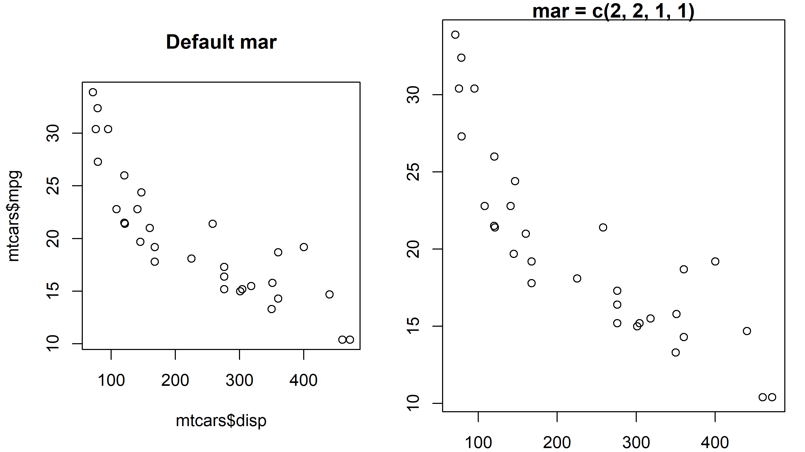
par(mar) on the space available to titles and labels
Because the units are lines of text, margins scale with cex and pointsize. A margin tuned on screen will be wrong in a high-resolution export unless you also raise pointsize. This is the single most common reason an exported figure looks cramped while the on-screen version looks fine.
mgp is three numbers: how many lines in from the edge the axis line sits, how many for the tick labels, and how many for the axis title. The default is c(3, 1, 0).
init <- par(no.readonly = TRUE)
par(mfrow = c(1, 2))
plot(mtcars$disp, mtcars$mpg, main = 'mgp = c(3, 1, 0)')
par(mgp = c(2, 0.7, 0))
plot(mtcars$disp, mtcars$mpg, main = 'mgp = c(2, 0.7, 0)')
par(init)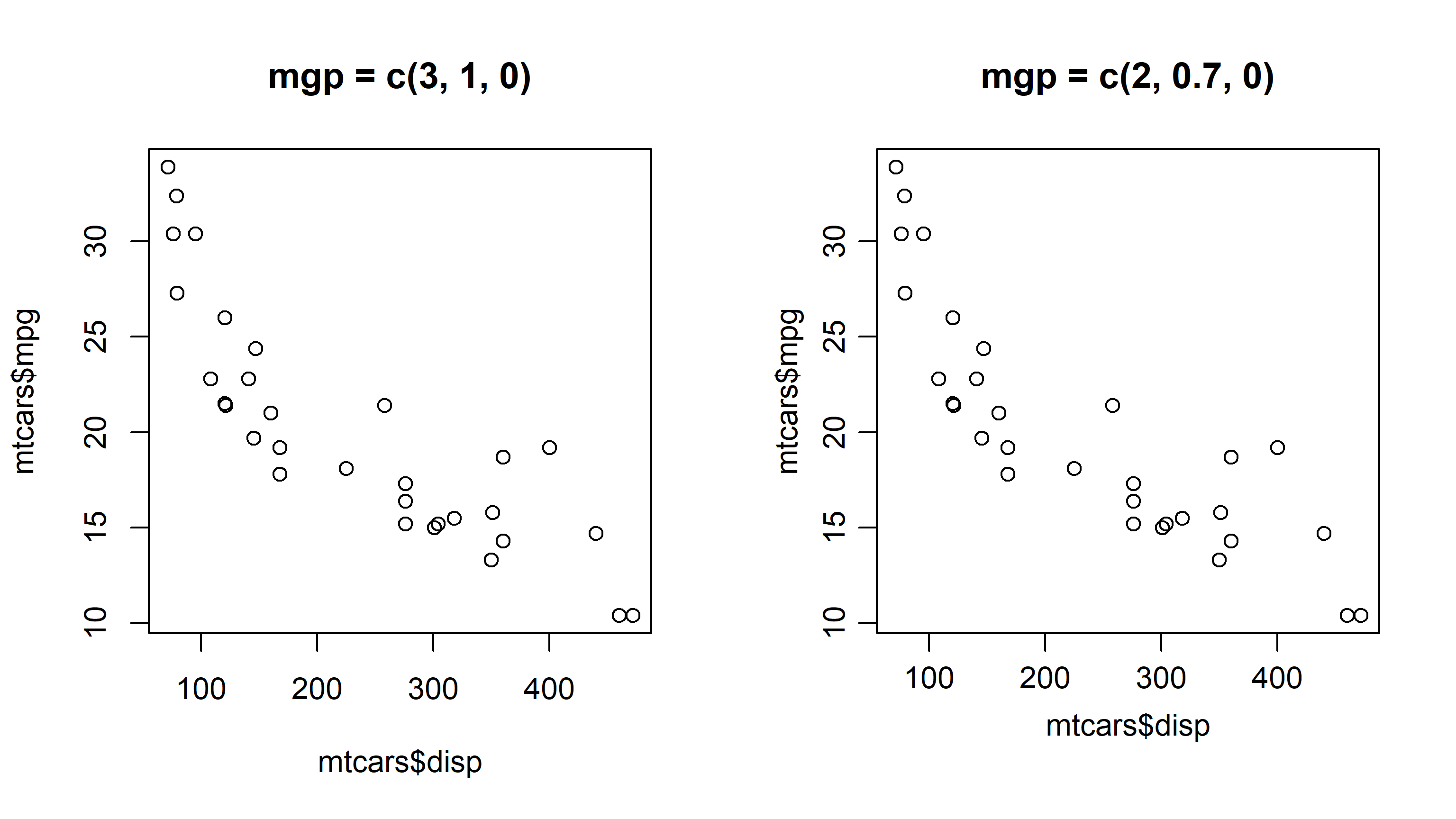
par(mgp) on axis label placement
las controls the orientation of tick labels: 0 (default) always parallel to their axis, 1 always horizontal, 2 always perpendicular, 3 always vertical. las = 1 is worth setting on any chart with numeric ticks — it stops labels from being drawn slanted on the y axis.
init <- par(no.readonly = TRUE)
par(mfrow = c(1, 2))

par(las = 1)
plot(mtcars$disp, mtcars$mpg, main = 'las = 1 (horizontal)')

par(las = 0)
plot(mtcars$disp, mtcars$mpg, main = 'las = 0 (parallel to axis)')

par(init)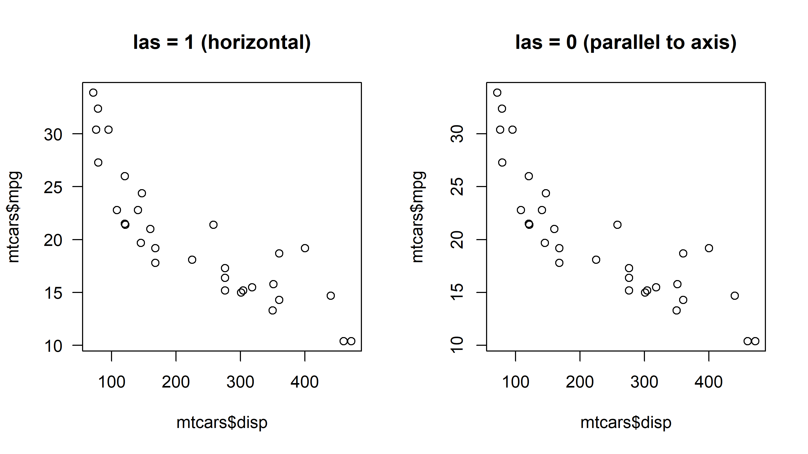
par(las) on the orientation of axis labels
bty chooses the box drawn around the plot: 'o' (default, all four sides), 'l' (axes only — usually what you want), '7', 'u', '.', '['.
xaxs and yaxs default to 'r', which extends the axis range by 4% at each end so points do not sit on the frame. Set them to 'i' for the exact data range.
init <- par(no.readonly = TRUE)
par(mfrow = c(1, 2))
plot(mtcars$disp, mtcars$mpg, main = "bty = 'o'", bty = 'o')
par(bty = 'l')
plot(mtcars$disp, mtcars$mpg, main = "bty = 'l'", bty = 'l')
par(init)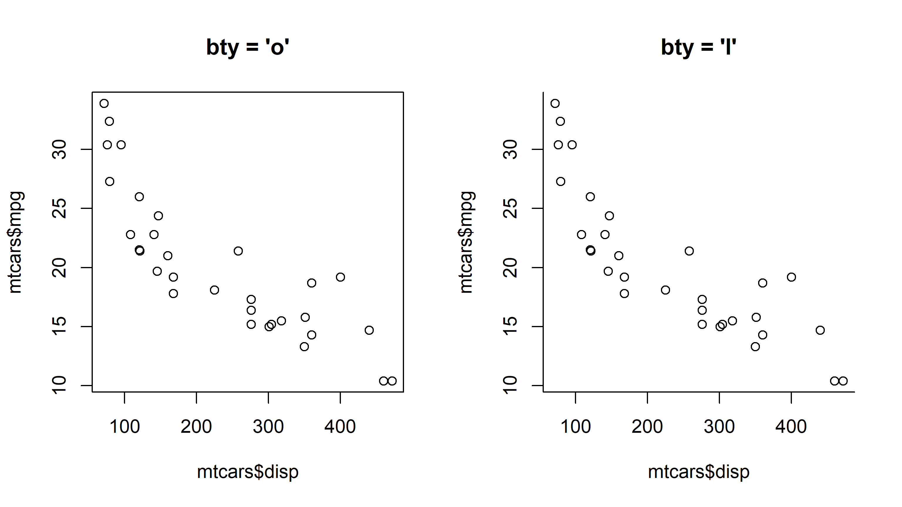
par(bty) on the box drawn around the plot
tck is tick length as a fraction of the axis interval. Positive draws ticks inside, negative outside, and 0 removes them.
init <- par(no.readonly = TRUE)
par(mfrow = c(1, 2))
plot(mtcars$disp, mtcars$mpg, main = 'tck = 0.02 (inside)', tck = 0.02)
par(tck = -0.02)
plot(mtcars$disp, mtcars$mpg, main = 'tck = -0.02 (outside)', tck = -0.02)
par(init)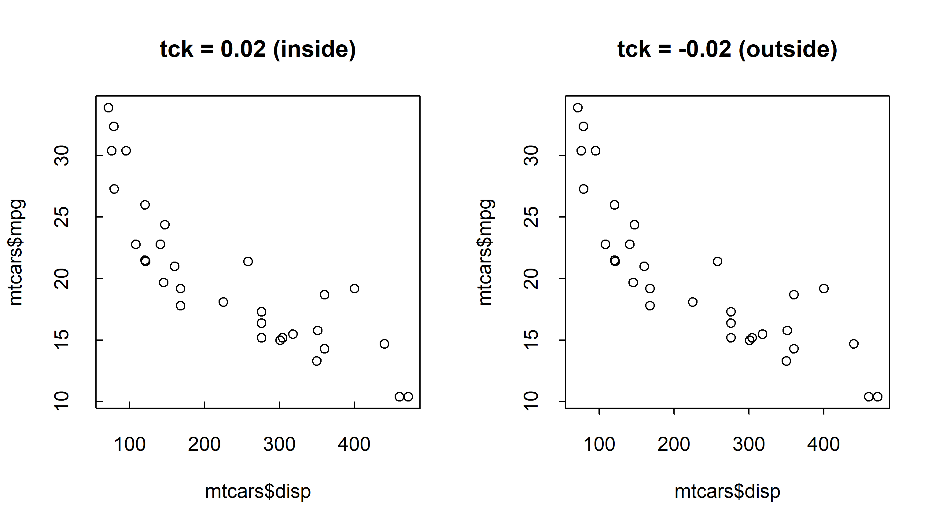
par(tck) on tick mark direction
par()is device state, so it persists until changed. Capture and restore it rather than hand-writing the old values back —op <- par(mar = c(2, 2, 1, 1))returns the previous values invisibly, andpar(op)puts them back exactly. In a function, wrap that inon.exit(par(op))so an error cannot leave the device mangled for whatever runs next.
The automatic axis picks ticks at “nice” numbers. Sometimes you need ticks where your data actually is — at quarters, at round dates, at the values that matter.
axis() draws an axis manually. Its arguments are the side (1 bottom, 2 left, 3 top, 4 right), the positions, and the labels.
d <- c(1, 2, 3, 5, 8, 13)
plot(d, type = 'b', col = 'blue', xaxt = 'n', xlab = 'Position',
     ylab = 'Value')
axis(1, at = seq_along(d), labels = LETTERS[seq_along(d)])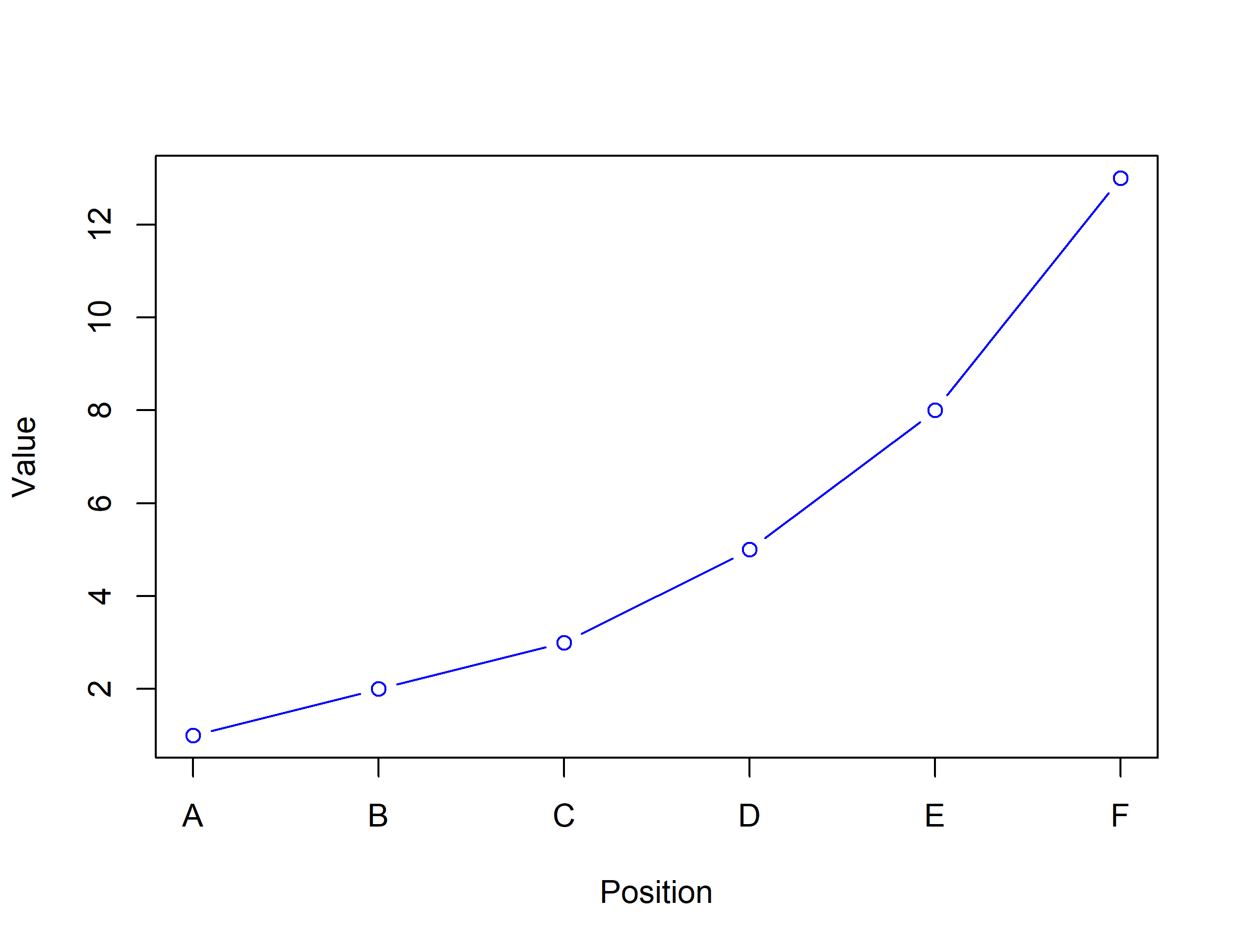
axis() and custom labels
xaxt = 'n' removes the automatic axis first. Without it you draw two axes over each other, which is a common and confusing bug.
To blank the labels but keep the ticks, ask for them explicitly:
d <- c(1, 2, 3, 5, 8, 13)
plot(d, type = 'b', col = 'blue', xlab = 'Position', ylab = 'Value')
axis(1, at = seq_along(d), labels = FALSE)
axis(4)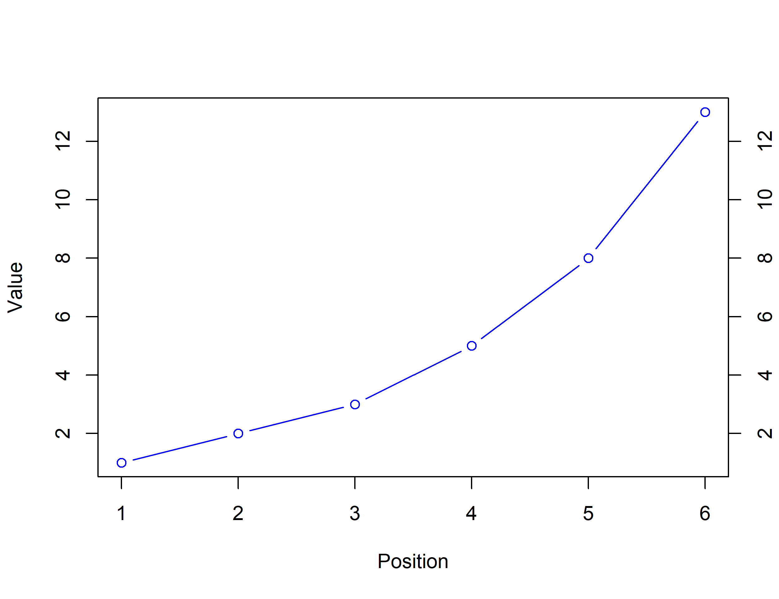
axis(4) adds a second axis on the right — the standard way to show a different unit on the same plot.
Dates work because axis positions are numeric and the labels are text:
sales <- c(120, 145, 138, 160, 155, 171, 180)
when <- as.Date('2026-01-01') + 0:6 * 30
plot(when, sales, type = 'b', col = '#0072B2', pch = 19,
     xaxt = 'n', xlab = '', ylab = 'Sales')
axis(1, at = as.numeric(when),
     labels = format(when, '%b %d'), las = 1)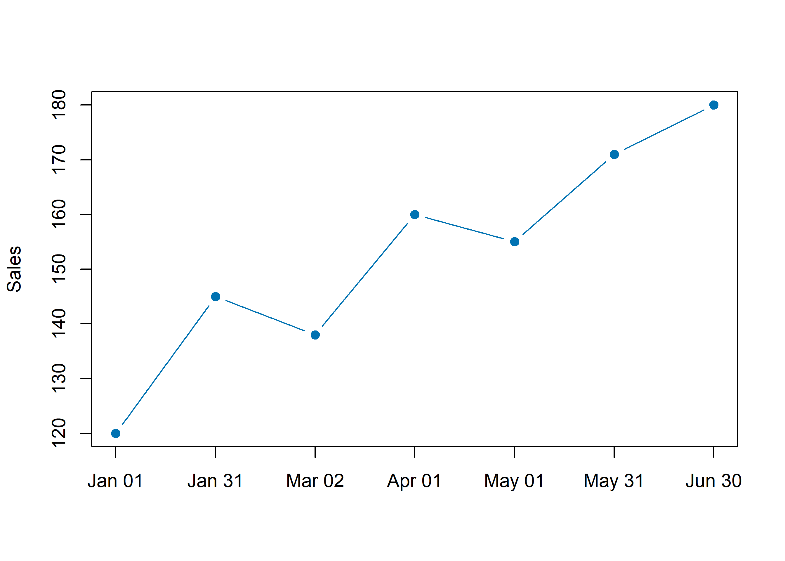
axis(), formatted from numeric positions
las = 1 there is doing real work: with six month-start dates the default would slant them into each other.
Colour is where accessibility quietly fails, and the fix used to require a package. It no longer does — R 4.1 and later ship palettes designed to be distinguishable under the common forms of colour vision deficiency.
palette.pals()That lists every built-in palette by name. The one to reach for is "Okabe-Ito", a colourblind-safe qualitative palette:
palette.colors(palette = 'Okabe-Ito')Two things to notice. The values come back as hex strings printed by R, and you should use them exactly as printed. Hand-typing a hex code from memory or from a blog post is how palettes get subtly wrong. Second, the first colour is black, so index with [-1] or keep it deliberately — a plot whose first series is black tends to look like an axis.
pal <- palette.colors(palette = 'Okabe-Ito')[-1]

plot(mtcars$disp, mtcars$mpg, type = 'n',
     xlab = 'Displacement', ylab = 'Miles per gallon')
points(mtcars$disp, mtcars$mpg, pch = 19, col = pal[1])
legend('topleft', legend = '4 cyl', pch = 19, col = pal[1], bty = 'n')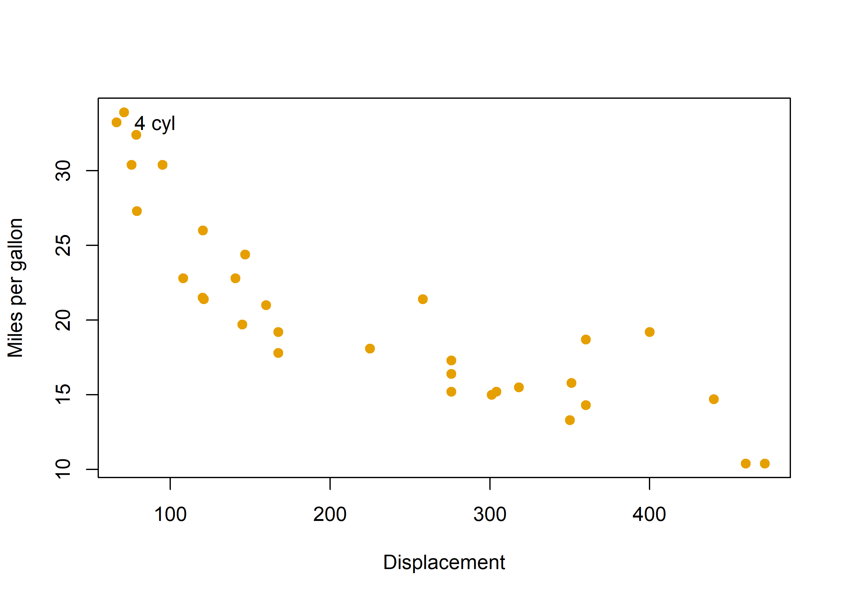
Colours are recycled if you ask for more than the palette holds, and recycling is not a good idea — the fifth and first series would be identical. palette.colors() also accepts alpha, which is the easy way to get a translucent fill without hand-converting colours:
palette.colors(palette = 'Okabe-Ito', alpha = 0.5)The other accessibility test is printing. A figure that relies on colour alone often collapses when photocopied, and the check costs three lines — because luminance is a fixed weighted sum of the RGB channels.
pal <- palette.colors(palette = 'Okabe-Ito')[-1]
rgb <- t(grDevices::col2rgb(pal)) / 255
# Rec. 601 luma weights. Perceptual lightness is not the same as the mean of
# the three channels, which is why the naive average looks wrong.
luma <- rgb %*% c(0.299, 0.587, 0.114)
grey <- grDevices::rgb(luma, luma, luma)

init <- par(no.readonly = TRUE)
par(mfrow = c(1, 2), mar = c(4.5, 4, 3, 1))
plot(mtcars$disp, mtcars$mpg, type = 'n',
     xlab = 'Displacement', ylab = 'mpg', main = 'Colour')
points(mtcars$disp, mtcars$mpg, pch = 19, col = pal[1:3])
plot(mtcars$disp, mtcars$mpg, type = 'n',
     xlab = 'Displacement', ylab = 'mpg', main = 'Same palette, greyscale')
points(mtcars$disp, mtcars$mpg, pch = 19, col = grey[1:3])
par(init)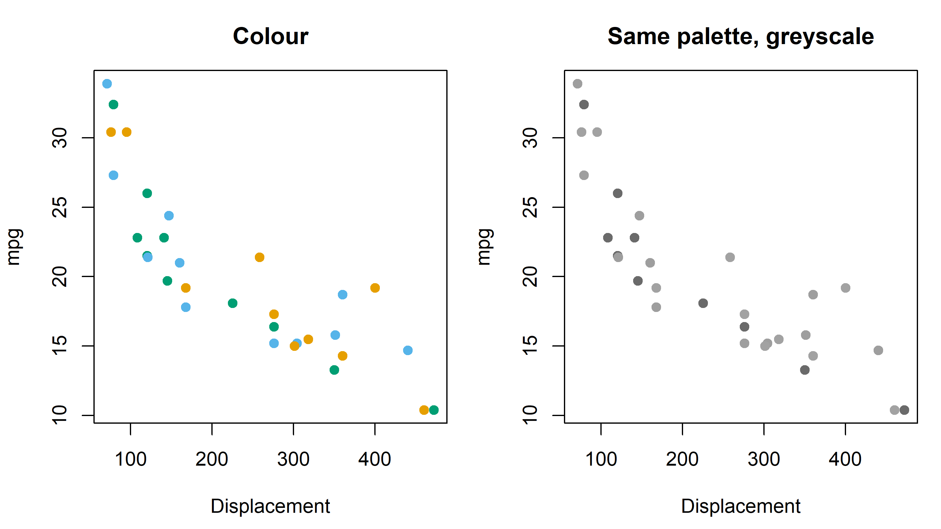
If a greyscale version of your figure has three series that are hard to tell apart, colour was doing work it should not have been asked to do alone. Add a second channel — pch, lty, or direct labels.
Work through these before moving on. The solutions are collapsed so you can try first; expand them when you are stuck or when you want to compare approaches.
Export the mtcars scatterplot as a 6-by-4-inch PNG at 300 dpi, with margins tight enough that the axis labels are not clipped. Print the resulting file size to confirm it is non-zero.
outdir <- file.path(tempdir(), 'ex1')
dir.create(outdir, showWarnings = FALSE)

f <- file.path(outdir, 'mtcars.png')
png(f, width = 6, height = 4, units = 'in', res = 300)

# mar is in lines of text, so it has to be set inside the device whose
# pointsize it should be interpreted against.
op <- par(mar = c(4, 4, 2.5, 1))
plot(mtcars$disp, mtcars$mpg, pch = 19, col = '#0072B2',
     xlab = 'Displacement', ylab = 'Miles per gallon')
par(op)
dev.off()
png
2 cat(basename(f), file.info(f)$size, 'bytes\n')mtcars.png 17892 bytesThe size print is not decoration. A dev.off() left out of this script produces a zero-byte file and no error at all.
Draw the mpg against disp scatterplot with a y axis whose ticks sit only at the integers from 10 to 40, and no automatic y axis at all.
{r #| label: fig-ex2 #| fig-cap: "Exercise 2 solution: a custom y axis drawn with `axis(2, at = )`" #| fig-alt: "The scatterplot of displacement against miles per gallon, with the automatic y axis suppressed and replaced by ticks at 10, 20, 30 and 40 only." plot(mtcars$disp, mtcars$mpg, pch = 19, col = '#0072B2', yaxt = 'n', xlab = 'Displacement', ylab = 'Miles per gallon') axis(2, at = seq(10, 40, by = 10))
yaxt = 'n' is the y-axis equivalent of xaxt = 'n'. Omit it and the automatic axis is drawn first and then drawn over, which reads as slightly bold, doubled tick labels.
Write a three-page PDF, one plot per page, using a loop over the three cylinder groups in mtcars, and confirm the file exists afterwards.
outdir <- file.path(tempdir(), 'ex3')
dir.create(outdir, showWarnings = FALSE)

f <- file.path(outdir, 'by-cyl.pdf')
pdf(f, width = 6, height = 4)

op <- par(mar = c(4, 4, 3, 1))
for (g in sort(unique(mtcars$cyl))) {
  plot(mtcars$disp[mtcars$cyl == g],
       mtcars$mpg[mtcars$cyl == g],
       pch = 19, col = '#0072B2', xlim = range(mtcars$disp),
       main = paste(g, 'cylinders'), xlab = 'Displacement',
       ylab = 'Miles per gallon')
  plot.new()   # advances to the next page
}
par(op)
dev.off()
png
2 file.exists(f)[1] TRUENote what pdf() does not do: it does not start a new page per plot. In base graphics every plot overwrites the last, so plot.new() is how you advance the page — and it is the PDF analogue of opening a new device inside the loop, for the same reason.
Everything in this chapter is summarised on the one-page par() and devices cheatsheet. It is a static artifact rather than a chapter, so it is worth keeping open next to whatever you are building.
That closes the book. Chapter 1 made the case for staying in base graphics; this chapter made the plots production-ready. The middle chapters taught the arguments one at a time, and that is the pattern to keep — change one thing, look at what happened.