head(AirPassengers) Jan Feb Mar Apr May Jun
1949 112 118 132 129 121 135This site uses Google Analytics to find out which chapters are useful and which are not. Nothing is sent to Google and no cookies are set unless you accept. See the privacy notice.
In this chapter, we will build line graphs. To be more specific we will learn to
segments()arrows()polygon()To build a line graph, we will learn a new argument in the plot() function called type. It allows us to specify the symbol that must be used to represent the data. Let us begin by building a simple line graph. We will use the AirPassengers data set in this chapter. Before we begin to build the plot, let us take a quick look at the data in order to understand what we are plotting.
head(AirPassengers) Jan Feb Mar Apr May Jun
1949 112 118 132 129 121 135In order to build a line plot, we will set the type argument in the plot() function to l (line). There are other values which type takes but we will explore them later.
data <- head(AirPassengers)
plot(data, type = 'l')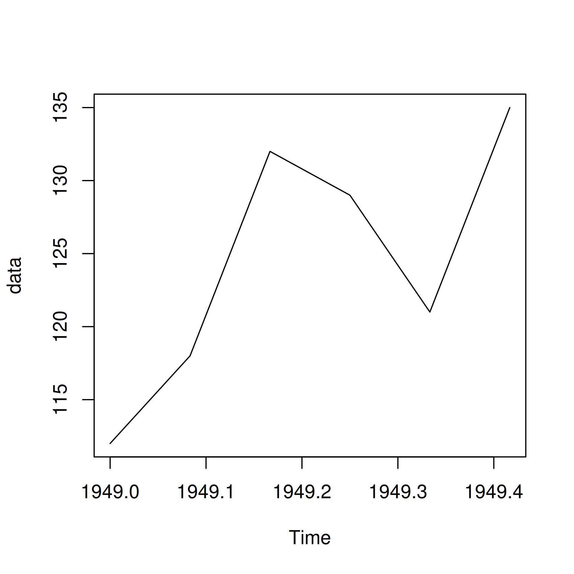
If you do not like plain lines, you can represent the data using lines interspersed with points by setting the type argument to b (both lines and points).
plot(data, type = 'b')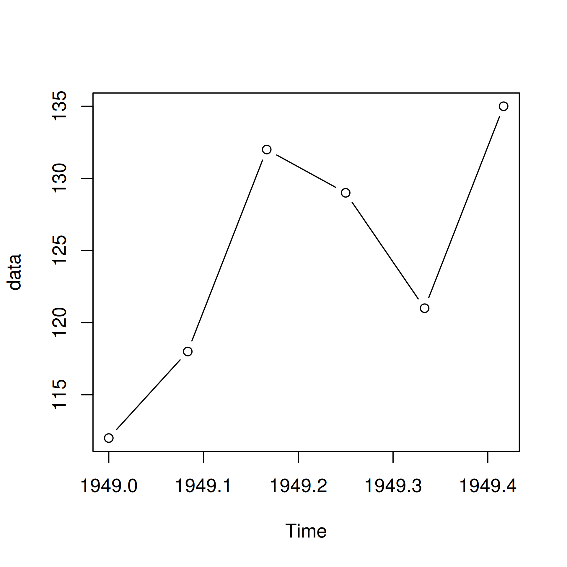
Another option is to have the points and lines overplotted. It can be achieved by setting the type argument to o (overplotted).
plot(data, type = 'o')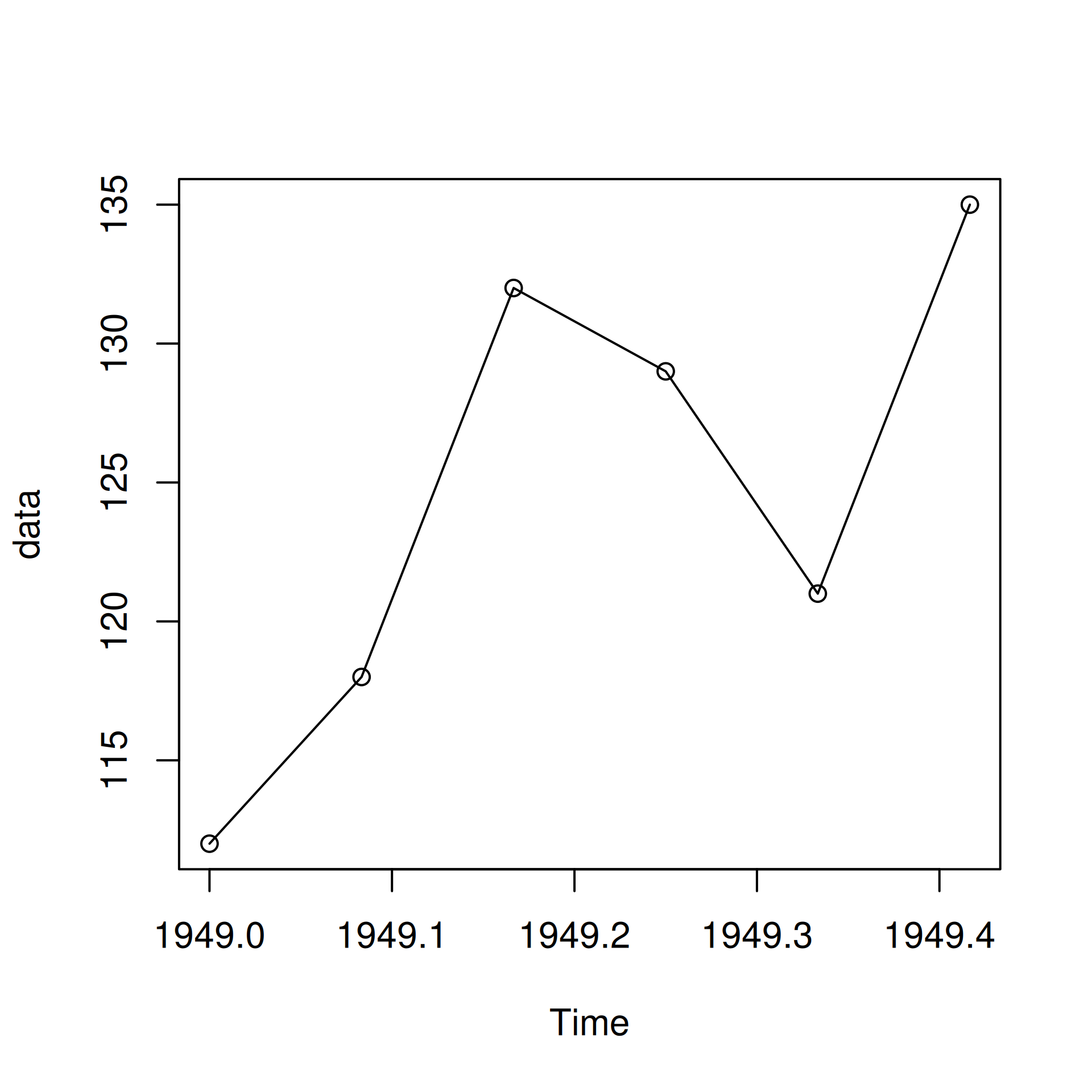
You can also create lines without points but with breaks instead by setting the type argument to c.
plot(data, type = 'c')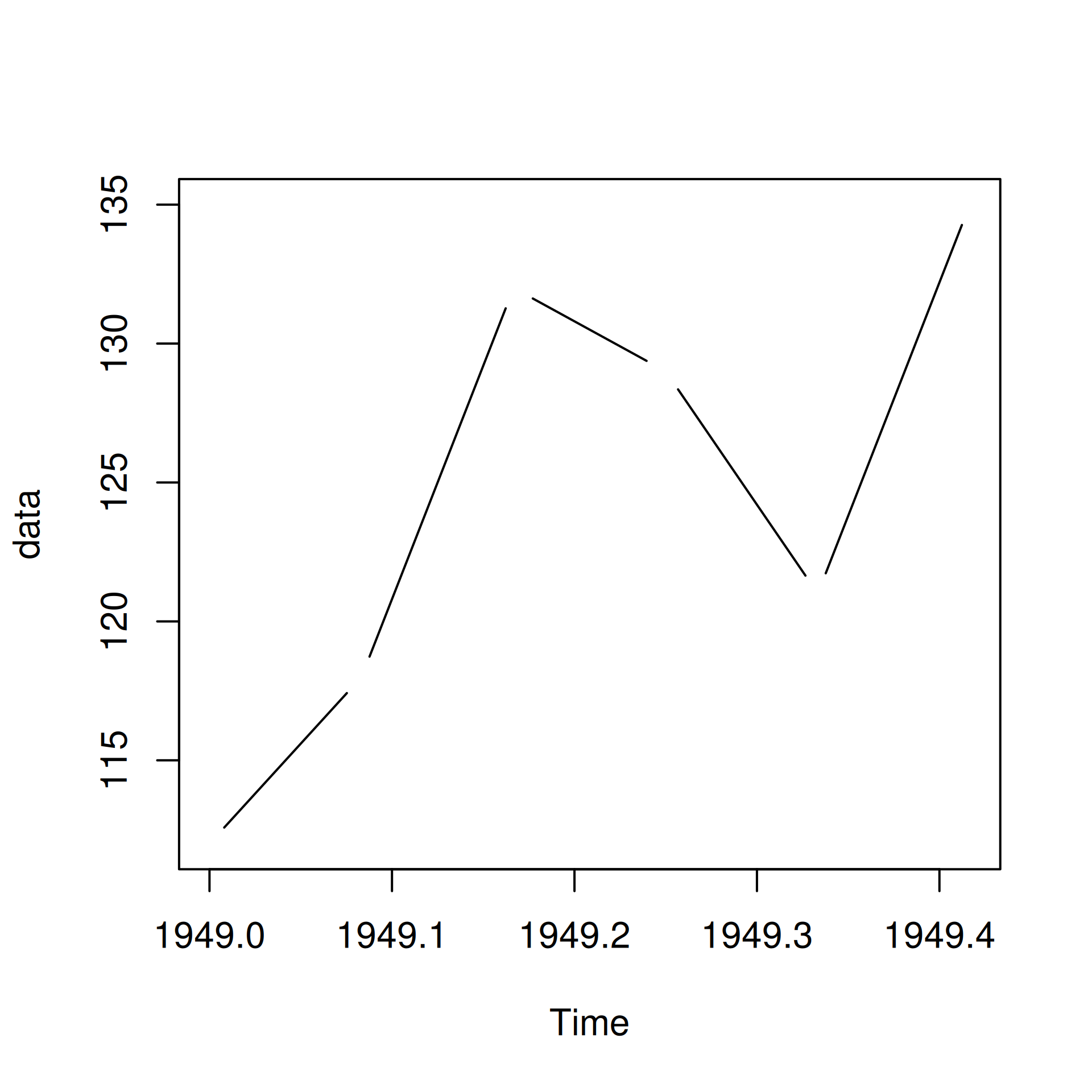
So now we know how to build a simple line graph. Let us now make this plot more elegant by modifying its appearance. Let us begin by adding some color to the line using the col argument in the plot() function.
plot(data, type = 'l', col = 'blue')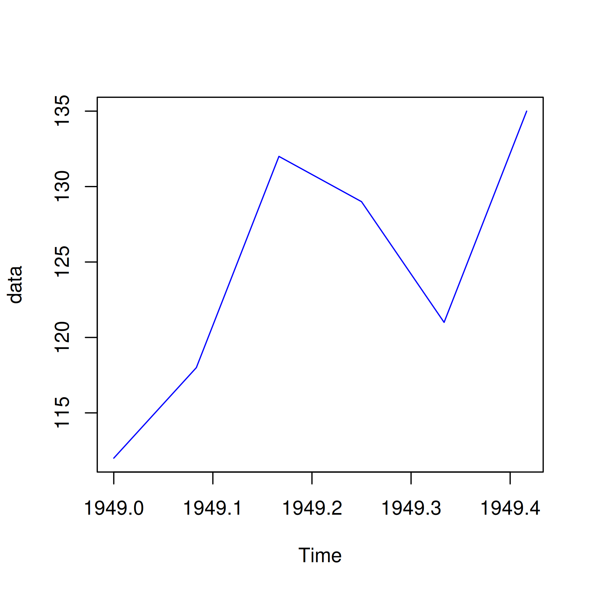
If you have points along with the line, they will have the same color as well.
plot(data, type = 'b', col = 'blue')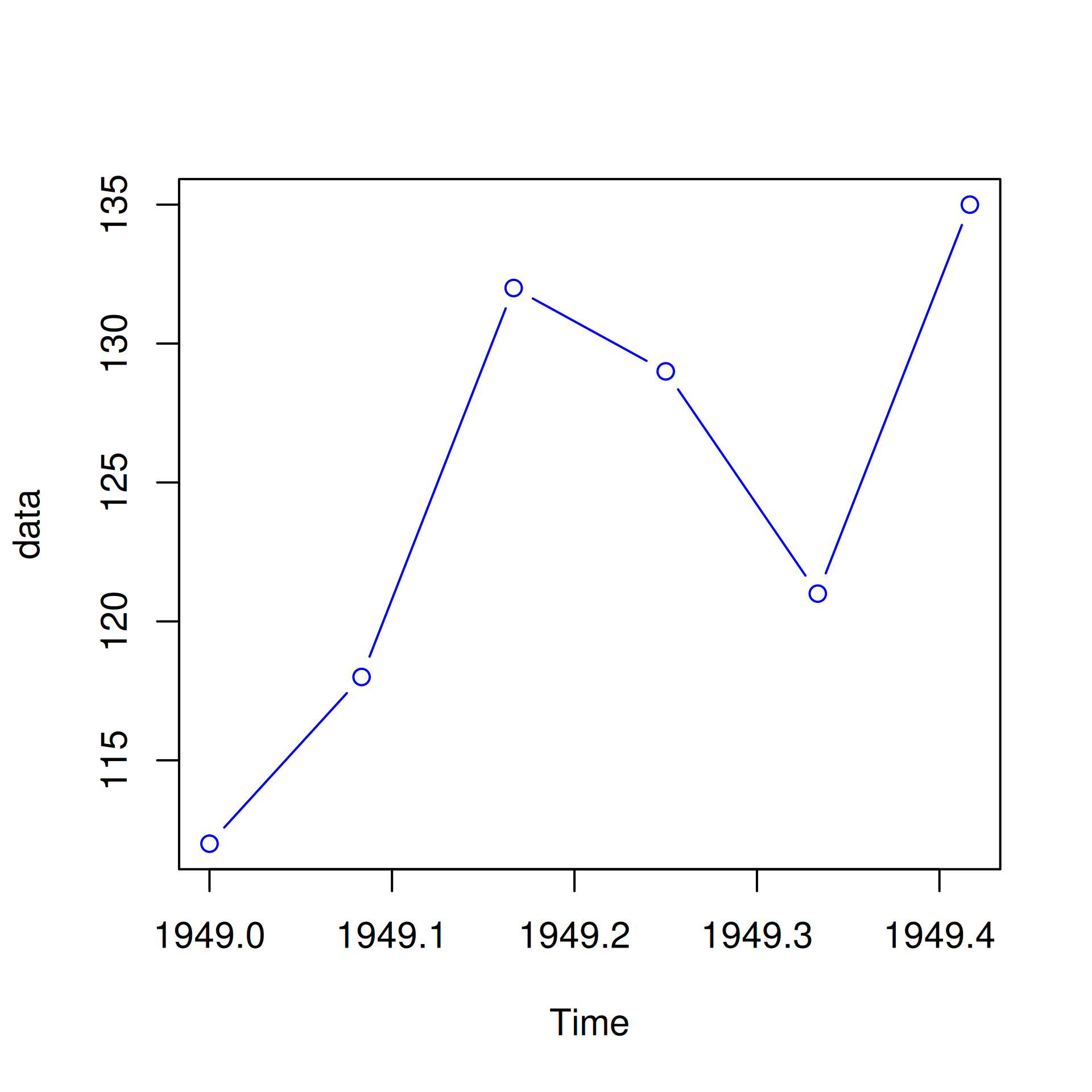
The line type can be modified using the lty argument. It takes values from 1 to 6 and the default value is 1. Below is an example:
plot(data, type = 'l', lty = 3)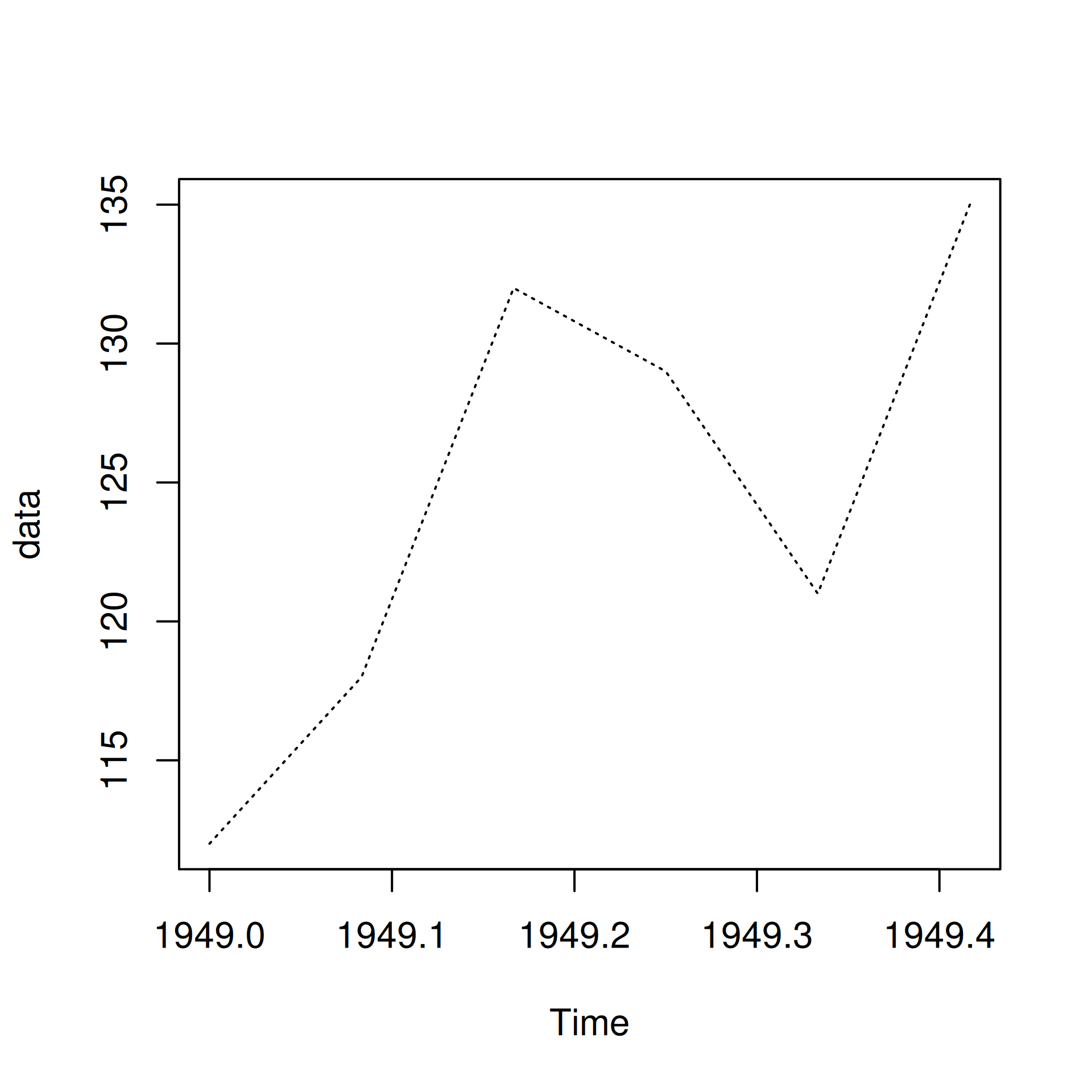
Let us look at all the line types in the below example:
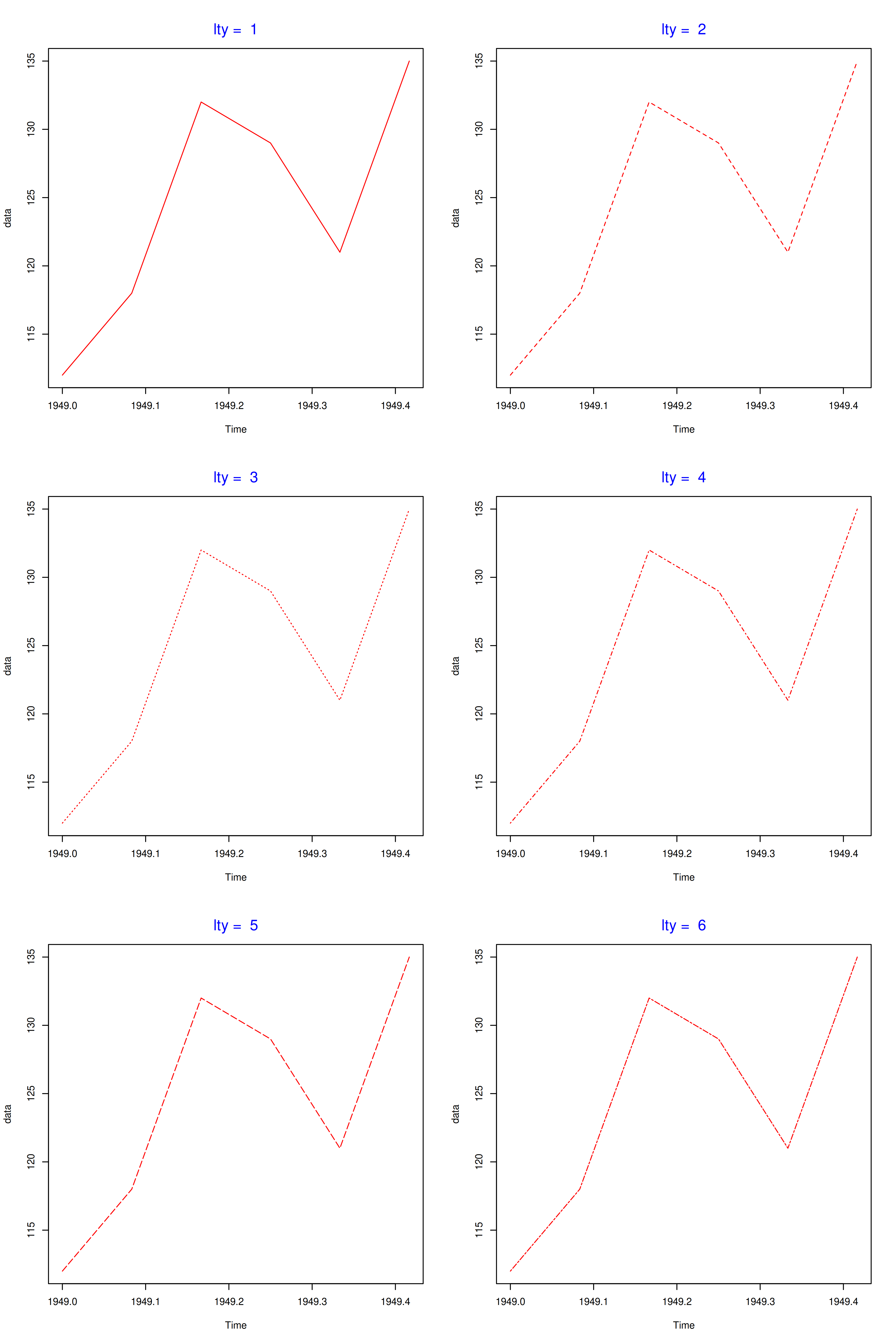
Instead of specifying the numbers 1:6, you can use their description as well.
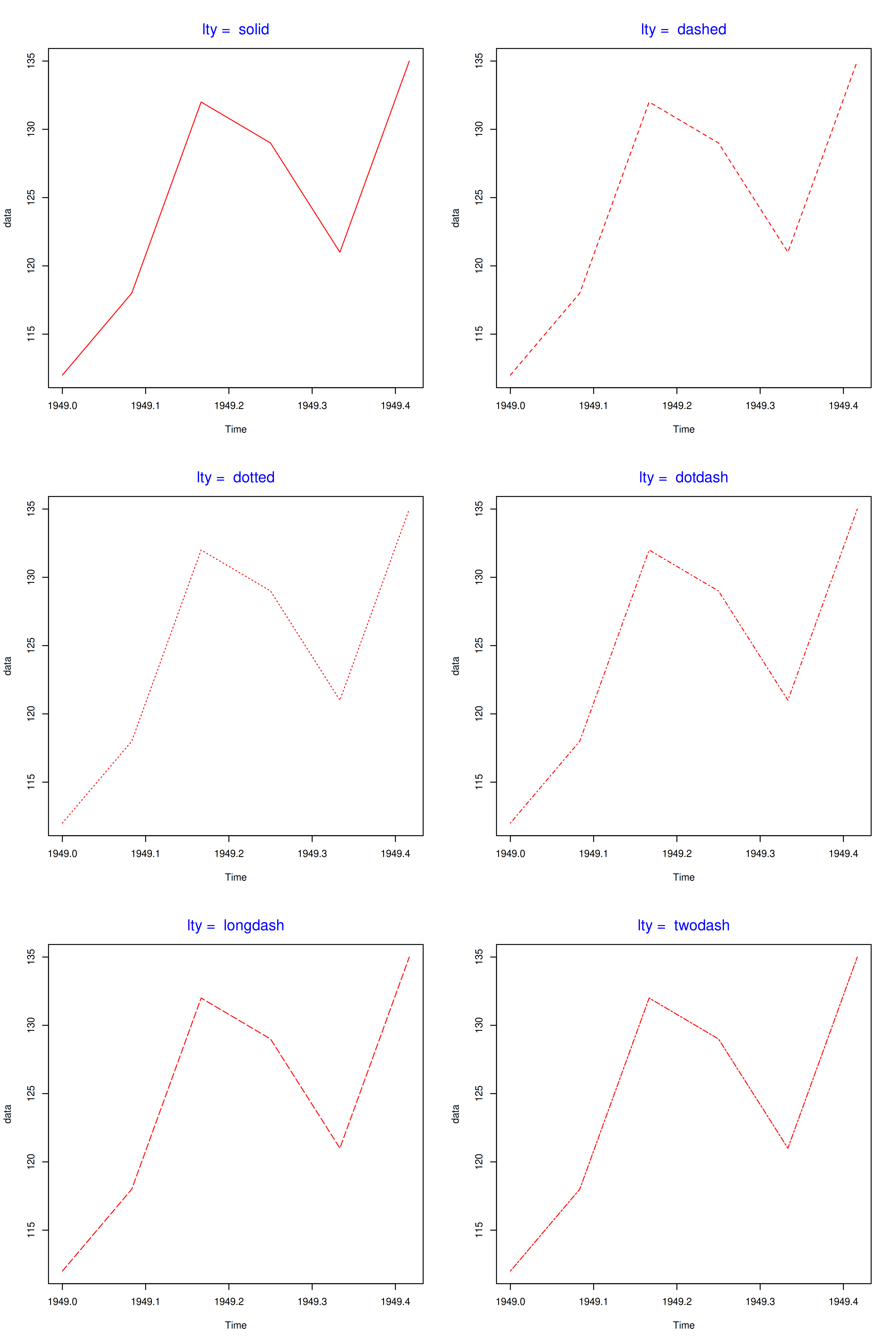
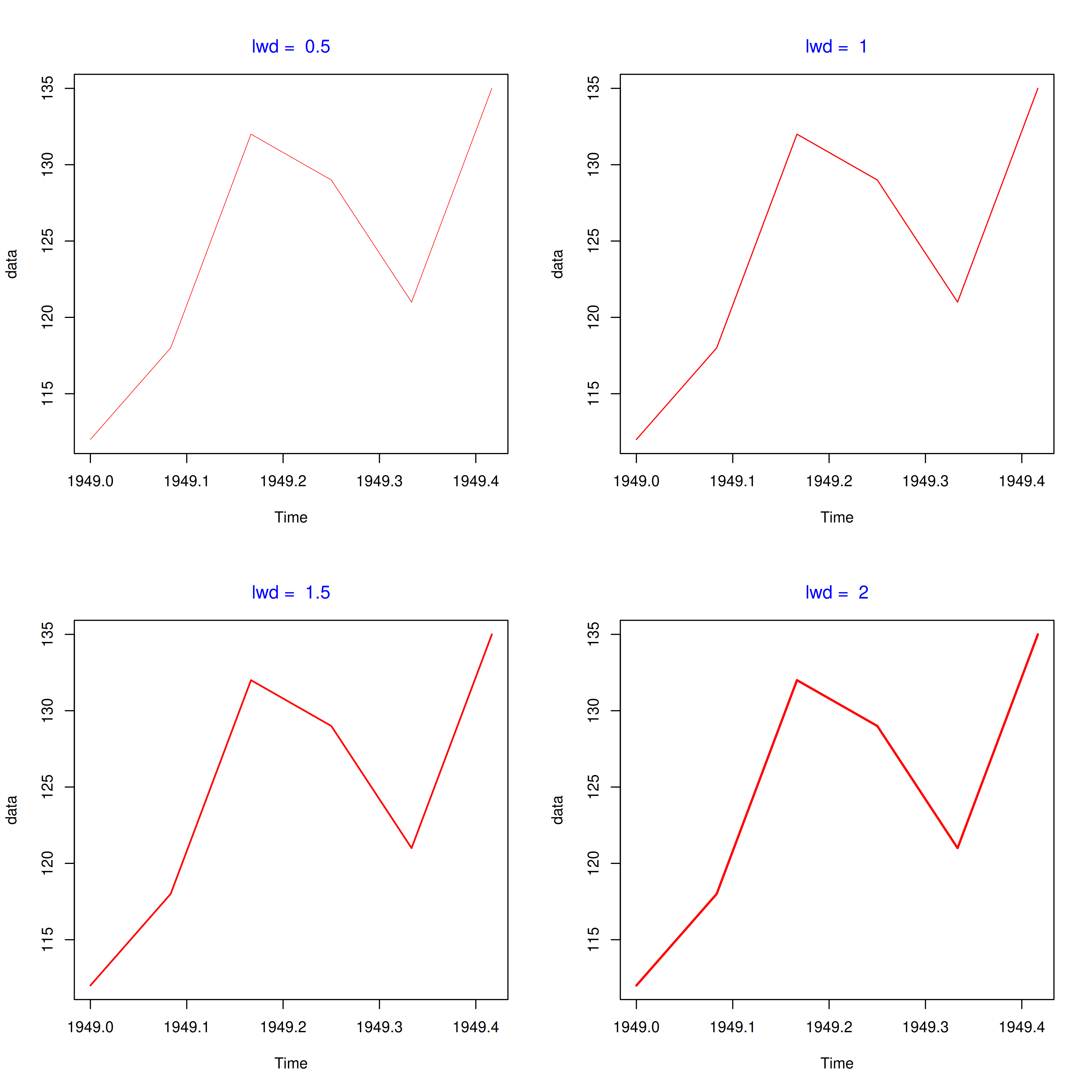
The width of the lines can be modified using the lwd argument in the plot() function. The default value for width is 1.
plot(data, type = 'l', lwd = 2.5)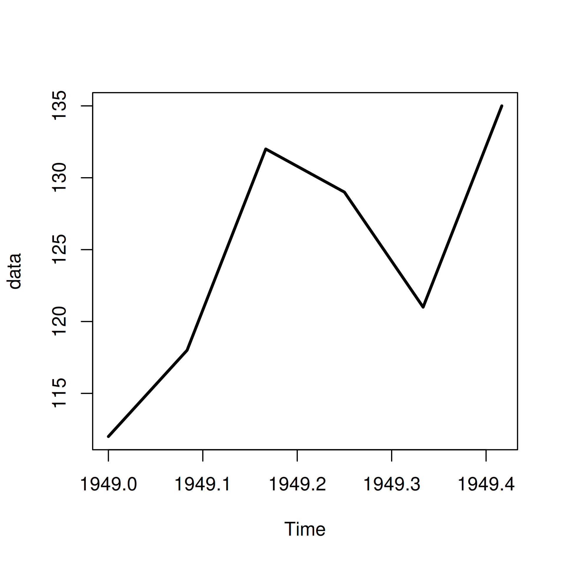
In the below example, we look at the width of the lines relative to the default value.
We can enhance the points in the line plot in the same way as we enhanced the points in the scatter plot in this previous chapter. Let us look at an example:
plot(data, type = 'b', pch = 23, col = 'red', cex = 1.5)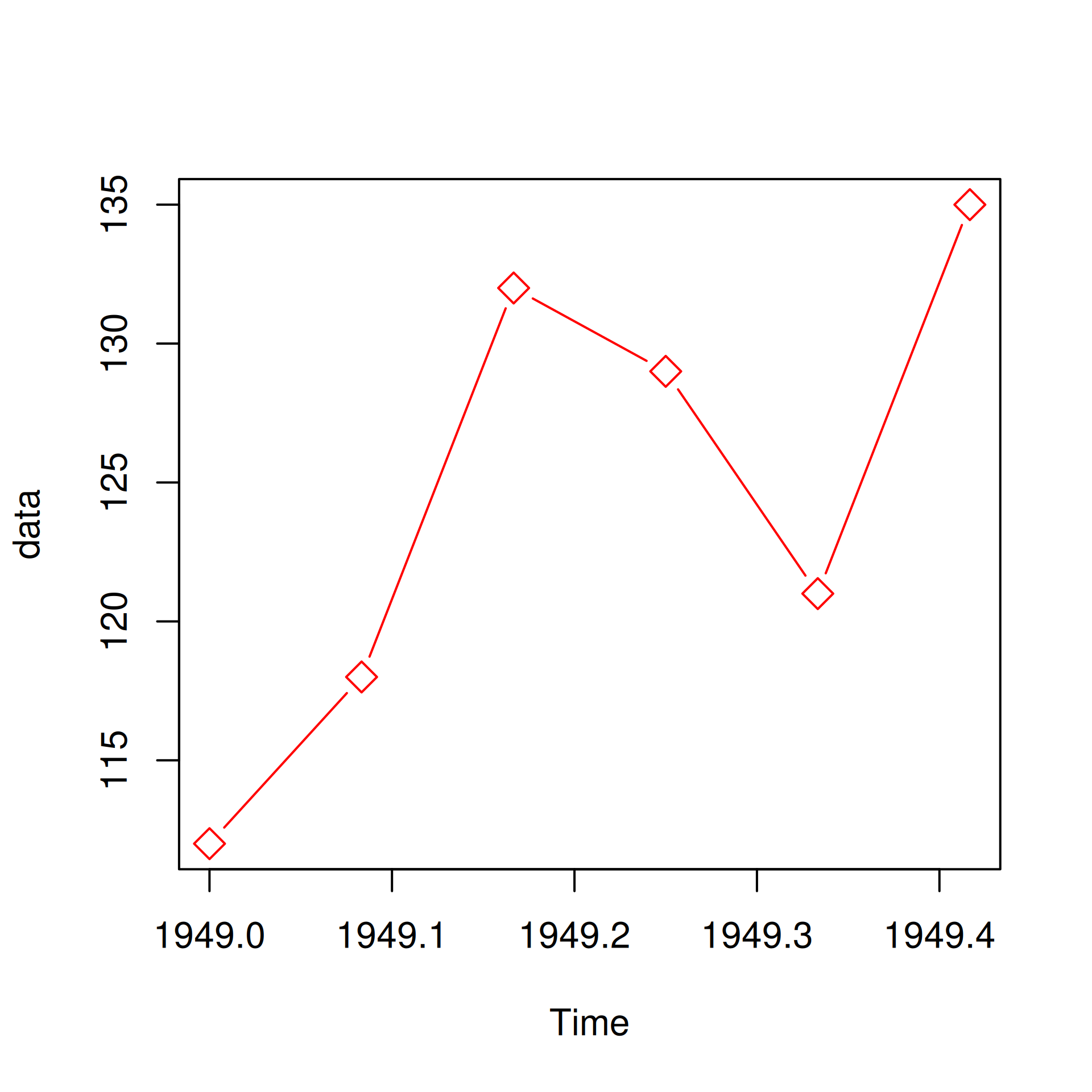
We have used the pch, col and cex arguments to modify the shape, color and size of the points. One drawback of the above method is that the color of the line and the points will be the same. What if we want them to have different colors? The solution is as follows:
plot() functionpoints() functionIn the next example, let us first build the line plot, add points using the points() function and then specify separate colors to the line and the points.
plot(data, type = 'l', col = 'red')
points(data, pch = 23, col = 'blue', bg = 'green', cex = 1.5)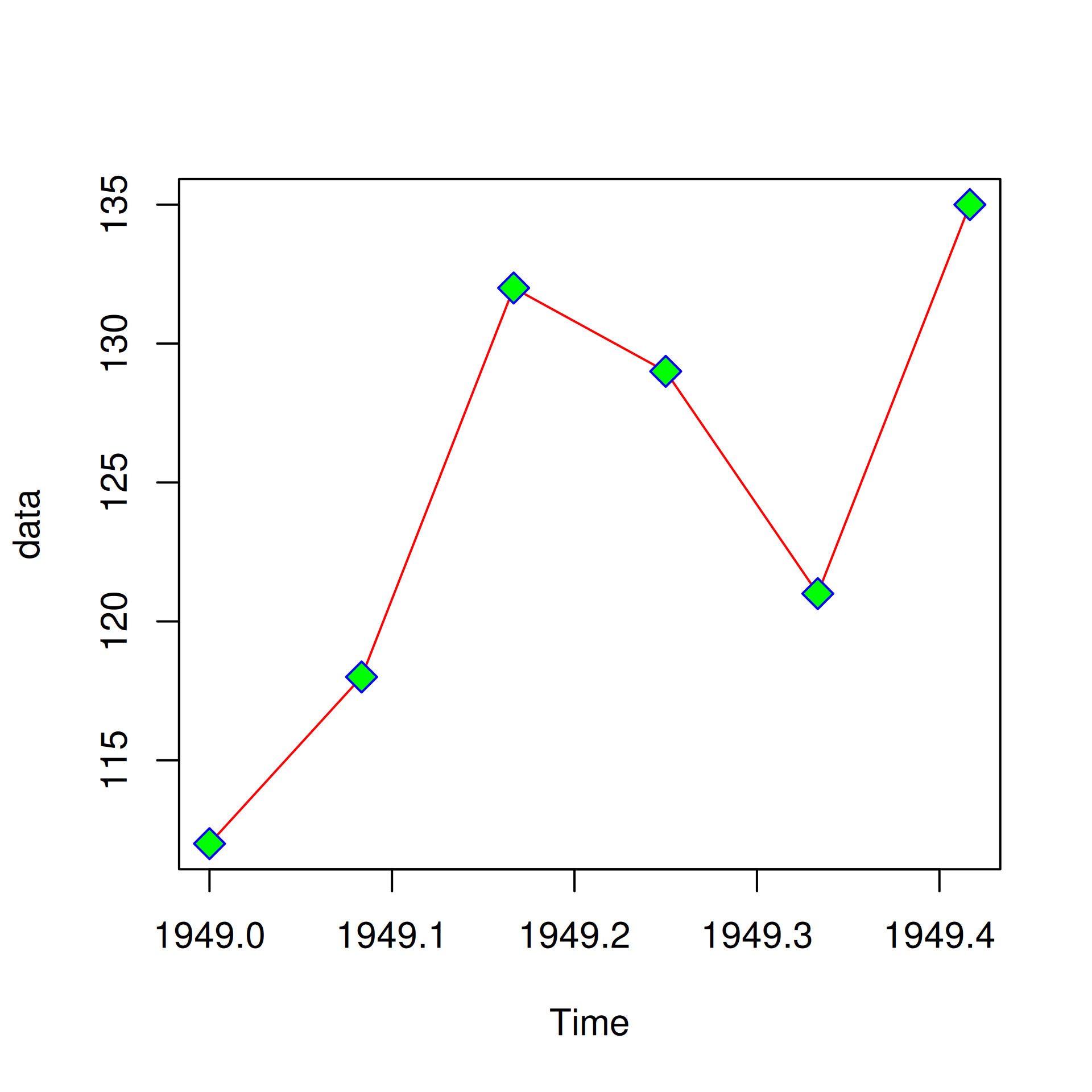
If you want to compare variables, you would want to add additional lines to the line graph. In R, this can be achieved using the lines() function. First we create the line plot using the base variable and then we can add as many lines as we want using the lines() function.
Before you add additional lines, it is important to ensure that the range of both the axis are modified to accommodate the data of the additional lines. If we do not modify the axis range, some of the lines will be outside the plot.
Let us now create a line plot and add an additional line using the lines() function.We will use some dummy data for this example:
data1 <- c(7.2, 7.6, 6.8, 6.5, 7)
data2 <- c(6.8, 7.2, 7.8, 7, 6.2)
plot(data1, type = "b", col = "blue")
lines(data2, type = "b", col = "red")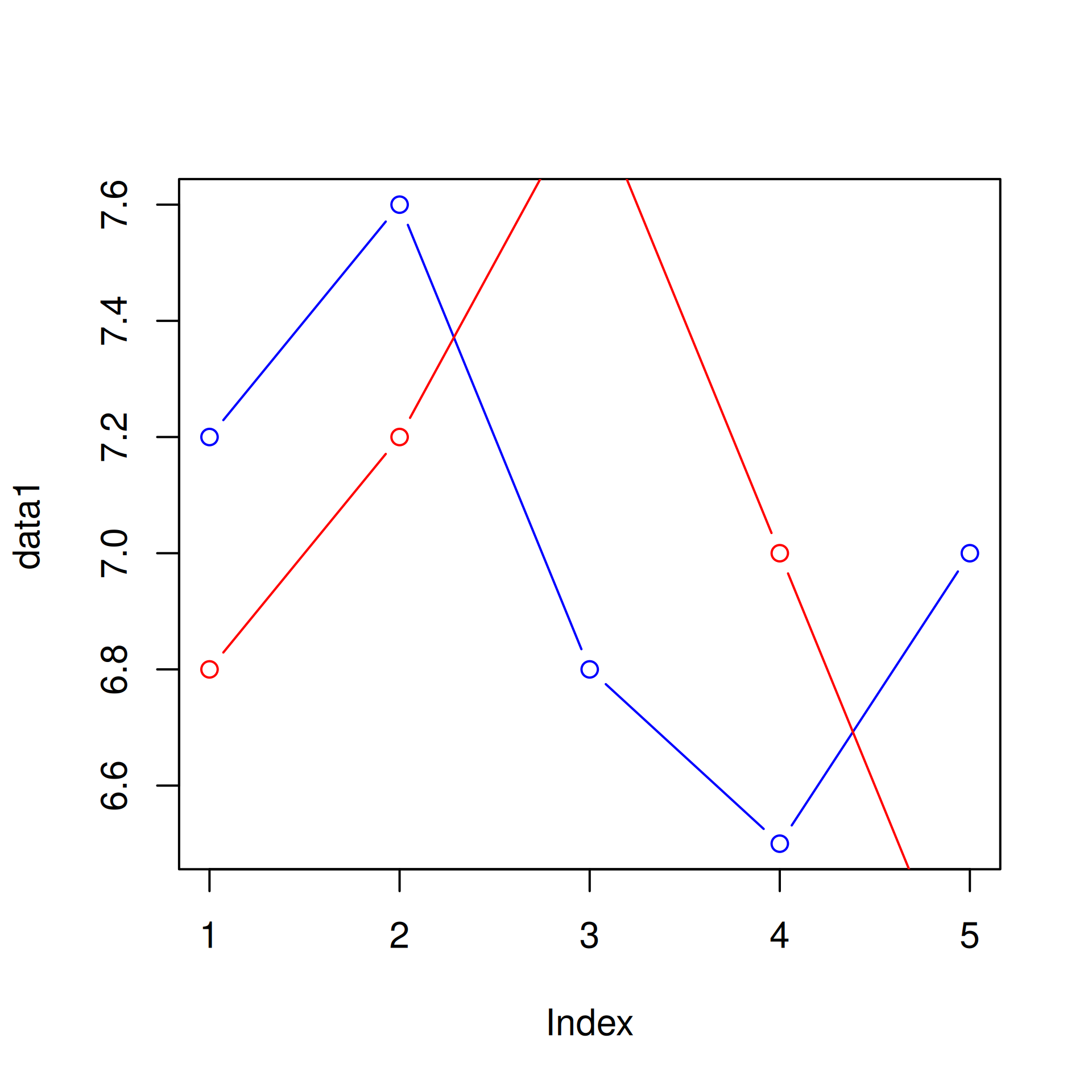
As you can see the second line is outside the plot. Let us recreate the plot but this time we will modify the range of the axis to accommodate the second line (data2).
plot(data1, type = "b", col = "blue", ylim = c(5, 9))
lines(data2, type = "b", col = "red")
A line through data points claims more precision than the data usually supports. Three functions close that gap, and they are the ones you will reach for the moment a plot leaves the screen and someone asks what it means.
segments() draws straight line segments between coordinate pairs. Its commonest use on a line graph is an error bar: a vertical segment centred on each point.
data1 <- c(7.2, 7.6, 6.8, 6.5, 7)
sd1 <- c(0.4, 0.6, 0.5, 0.7, 0.3)
plot(data1, type = 'b', col = 'blue', ylim = c(5, 9),
     xlab = 'Index', ylab = 'Data')
segments(1:5, data1 - sd1, 1:5, data1 + sd1, col = 'red', lwd = 2)
segments() takes four vectors: the x of each segment’s start, the y of the start, the x of the end, and the y of the end. Because all four are vectorised, one call covers every point. It also draws caps if you want them, via the horizontal segments underneath:
plot(data1, type = 'b', col = 'blue', ylim = c(5, 9),
     xlab = 'Index', ylab = 'Data')
segments(1:5, data1 - sd1, 1:5, data1 + sd1, col = 'red', lwd = 2)
# caps: two short horizontal segments per error bar
segments(1:5 - 0.1, data1 - sd1, 1:5 + 0.1, data1 - sd1, col = 'red')
segments(1:5 - 0.1, data1 + sd1, 1:5 + 0.1, data1 + sd1, col = 'red')
arrows() draws a line with a head at one end. Use it when the reader’s eye needs to be sent somewhere specific.
data2 <- c(6.8, 7.2, 7.8, 7, 6.2)
plot(data1, type = 'b', col = 'blue', ylim = c(5, 9),
     xlab = 'Index', ylab = 'Data', main = 'Arrow points at the gap')
arrows(4.4, 6.1, 3, 7.6, col = 'red', lwd = 2)
The first two arguments are where the arrow starts, the next two where it ends. That is the opposite of the order you would guess, and it is worth remembering: arrows(x0, y0, x1, y1) reads “from here, to there”.
Useful arguments: length sets the head size (0.1 is the default; 0 leaves a plain line), angle opens the head, and code picks the head shape — 1 for a closed arrow, 2 for an open one.
plot(data1, type = 'b', col = 'blue', ylim = c(5, 9),
     xlab = 'Index', ylab = 'Data', main = 'Open head, thinner line')
arrows(4.4, 6.1, 3, 7.6, col = 'red', lwd = 1.5, length = 0.15,
       angle = 30, code = 2)
polygon() draws a closed shape and fills it. On a line graph its use is a confidence band: shade the area between an upper and a lower bound, then draw the line on top.
The order of the points matters, because that is the order they get joined. For a band you want to walk along the top from left to right, then back along the bottom from right to left, so the shape closes on itself instead of crossing.
x <- 1:12
mid <- c(4.5, 5.2, 5.0, 6.1, 6.8, 7.4, 7.1, 8.0, 8.6, 9.1, 9.4, 10.2)
lo <- mid - 0.9
hi <- mid + 0.9

plot(x, mid, type = 'n', ylim = c(2, 12), col = 'blue',
     xlab = 'Month', ylab = 'Value')
polygon(c(x, rev(x)), c(hi, rev(lo)), col = '#DCE9F5', border = NA)
lines(x, mid, col = 'blue', lwd = 2)
points(x, mid, pch = 19, col = 'blue')
Two details carry that figure. The first is type = 'n', which sets up the axes and the plot region without drawing anything — the standard way to draw a plot in layers when the first layer is not the data itself. The second is rev(), which reverses a vector so the polygon can be closed in one call instead of building the point list by hand.
Note that polygon() is drawn first and lines() second. Anything you fill will cover anything already plotted, so background bands belong underneath.
Finally let us enhance the plot by adding a title and modifying the axis labels.
plot(data1, type = "b", col = "blue",
     ylim = c(5, 9), main = 'Line Graph',
     xlab = 'Index', ylab = 'Data')
lines(data2, type = "b", col = "red")
segments(1:5, data1 - 0.5, 1:5, data1 + 0.5, col = "blue", lwd = 2)
# Approach the peak from above-right so the arrow crosses neither series.
arrows(4.1, 8.5, 3.15, 7.85, col = "grey30", length = 0.1)